Showing posts with label Maine. Show all posts

Sunday, November 10, 2013

Autumn Revisited


The Color is Gone, But not Forgotten
Mine Ledge, Hinsdale, NH


Hemlock Gateway, Colors at Home


There are still patches of brown foliage on the oaks and the persistent yellow of the beach groves, but my New England autumn is winding down to the last gasps.  As always, I'm exhausted and ready for long quiet hours with a cup of coffee at my desk working through the hundreds of late September and October images.  I say it every year, but it is worth repeating, thank god for the dull colors of November!


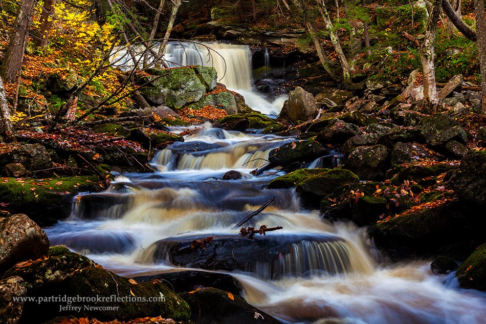
Otter Brook, Roxbury, NH
As I work my way through the autumn splendor, this seems like a good time to review the season and share some of this year's
bounty.   I'll let Jeff Foliage provide the final official verdict, but overall I think it was a good fall, not the best for weather or color but probably a bit better than average. The color seemed to come early, but I suspect this is a general manifestation of the warming climate.  We had one major wind and rain storm in early October which striped some of the brightest color.  The weather was often overcast, but that is not a tragedy for the capture of the rich colors of the season and the rain managed to keep the streams flowing.  As always, the season was expanded by small patches of early color in the damp areas and by the surprising color in the occasional late bloomers.  


Vermont's Route 100
Top of the Valley, Hnacock Vt
Most years I try to get a head start on the color by heading north.  This year I traveled up Route 100 along the central spine of Vermont.  My eventual goal was the dramatic Moss Glen Falls in Granville, Vermont.  The falls were great especially during the brief periods when the bright sun slipped behind the clouds.  There
Moss Glen Swirl, Granville, Vt
was
quite a crowd at this road-side attraction, but I was still able to catch some nice fresh angles on this old favorite.  The trip was about 100 miles each way and it gave me the opportunity to judge the progress of the fall change and get an early sense of the quality of the color.  On that day, in late September, the foliage seemed to blossom around the Killington area.


Autumn Boil, Chester, VT


Camden Harbor Sunrise
A Maine Coast Escape
Just as the colors were building at home Susan and I headed over to the Camden area to spend a few days on the Maine Coast. It was a lovely escape.  The colors were a bit early along the shore, but I did get some nice shots of the morning light on Camden and Lincolnville Harbors and a lovely sunset at the always dramatic Marshal Point Light.  I was nervous about missing some of the best color at home, but it was while we were away that the intense wind and rain storm hit the Monadnock region.  


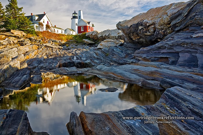
Marshall Point Light, Port Clyde, Maine


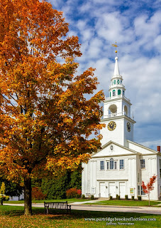
Hancock, NH
The damage was not as bad as I had feared but the storm did seem to accelerate the season.  Of course through all of this I spent every available moment looking for color throughout the region.  I roamed the back roads of both the Monadnock Region and southern Vermont, simultaneously scanning for grand landscapes and intimate color details.  It was enough to make me dizzy, but there was always the feeling that any time spent away would mean risking the one spectacular image of the year.  I was convinced that the best weather was confined to the days that I was stuck in the office.  In other words, I was fully captured by Autumn Fever. 


Follow the Color
As usual, this year I tried to extend the season by following the
Pumpkin Festival Race, Keene, NH
color from north to south.   It started with a drive up Route 100 to Moss Glenn Falls, and our sea coast interlude.  In the middle of the season, I explored more locally including lovely farm land in Chesterfield, Walpole, Hancock and southeastern Vermont.  We had great weather for the Keene Pumpkin Festival and when I wasn’t lighting candles I got nice light both early in the morning and at night in the midst of the celebration of Keene’s new World Record for lit Pumpkins (30,581).  As the colors began to fade locally I went south to shoot at Doane’s Falls in Royalston Massachusetts.
 
Doanes Falls, Royalston, Ma.


Embrace the Clouds
Field of Asters, Walpole, NH
Limit the Sky
Throughout the season we had a mix of sunny and overcast / misty weather.  In general, I prefer the softer light which allows the
autumn colors to shine through the glare.  The keys to shooting in overcast conditions are to concentrate on more intimate colorful scenes rather than grand hillside panoramas, and to limit or eliminate the dull gray skis.  Problems with flat uninteresting skies have been improved with the capability of powerful editing software, such as Photoshop and Lightroom 5 to salvage detail in the
Color and Sky, Walpole, NH
Embrace the Sky
highlights.  Although zooming in on the color is still a good solution, I find recently that I have been including more brooding gray skies in my images. A polarizing filter is a must on bright days, but it can also add depth to the color when the light is diffused.  The effect is often subtle but noticeable especially if the leaves are damp and reflective.  The combination of soft light and a polarizer is also the best combination for capturing lacy waterfalls against the autumn glow.


Tame the Brilliance
Hunts Pond, Hancock, NH
We had a few classic brilliantly sunny days this year.  These are the days that most often come to mind when we think of the “glorious colors” of fall, but they do offer special challenges for photography.  The high contrast and reflections tend to mute the colors, but here again a polarizing filter can make a
Reflected Sunset, Chesterfield, NH
significant difference.  Sunny days are best for broader autumn landscapes, but on these days I most often think about looking into the sun.  The trans-illuminating light works to ignite the foliage.  The effect is especially striking when the electric yellows and reds are contrasted against a deep blue sky. Of course we need sunlight to capture beautiful sunrises and sunsets, but the the most dramatic results come from a mixture of light and clouds. The warm light of the golden hours can only be fully appreciated by capturing what it illuminates, and, when there are no clouds, 
we often need to step back and celebrate the glow on the foreground elements.


Trans-illumination, College Bridge, Henniker, NH
 
Well I have to get back to work.  I love settling back and scanning my images from the season.  Each time I find new perspectives and I can't wait to discover the beauty which is held within those little piles of pixels.  Stay tuned.

Bald Mountain, Camden Maine

Saturday, October 5, 2013

Simple Gear to Improve Your Photography


Pemaquid Light
 Sue and I are getting ready to head off to Camden Maine for a few days at the beginning of next week.  Hopefully we will catch some nice color, but as a result, this week’s blog will be a short equipment recommendation.  It great to talk about the latest cameras or big lens’, but some of the most important gear are not the most expensive, but things that fit, almost invisibly, into your everyday process.  For me one of those simple but essential pieces of equipment, which I use on every shot, is my L Bracket.


Gearing up at the Maine Media Workshop


Marshall Point Light
Back several years ago I took a wonderful workshop at the Maine Media Workshops with Vermont landscape photographer David Middleton.  Early fall was a perfect time to explore the Maine coast with a small group of enthusiastic photographers.  I had been attracted to David’s workshop after reading his book on photography in Vermont.  It was a helpful guide but what really interested me was David’s no sense approach to photography.   Over the course of a week we had a wonderful and exhausting time shooting the coastal icons including Marshal Point Light, Rockport Harbor, Stonington, and   Pemaquid Light.  I had a great time and caught some wonderful shots, but the most long-lasting part of the workshop came at the end.  It was just a wrinkled piece of paper.


Throughout the week David gently critiqued, both our
photographic technique, and our equipment.  He kept coming up with recommendations about how I could up-grade my kit.  Among other things, he suggested a new, sturdier tripod and ball
David Middleton hard at work
head, a set of variable neutral density filters and an L-Bracket.  It was a substantial list and I told David that I would need a note for my wife justifying the purchase of this essential equipment.  And he came through.  On a crumpled piece of paper he scribbled the list of gear along with his assurance that the acquisition of these items would make me a more proficient and satisfied photographer and therefore a much more pleasant spouse.  Surprisingly Susan went for it and didn’t crumble as I gleefully went on a  B&H shopping spree.  Off all the equipment that David recommended the L-Bracket probably had the most significant impact on my day-to-day photography.


The L-Bracket
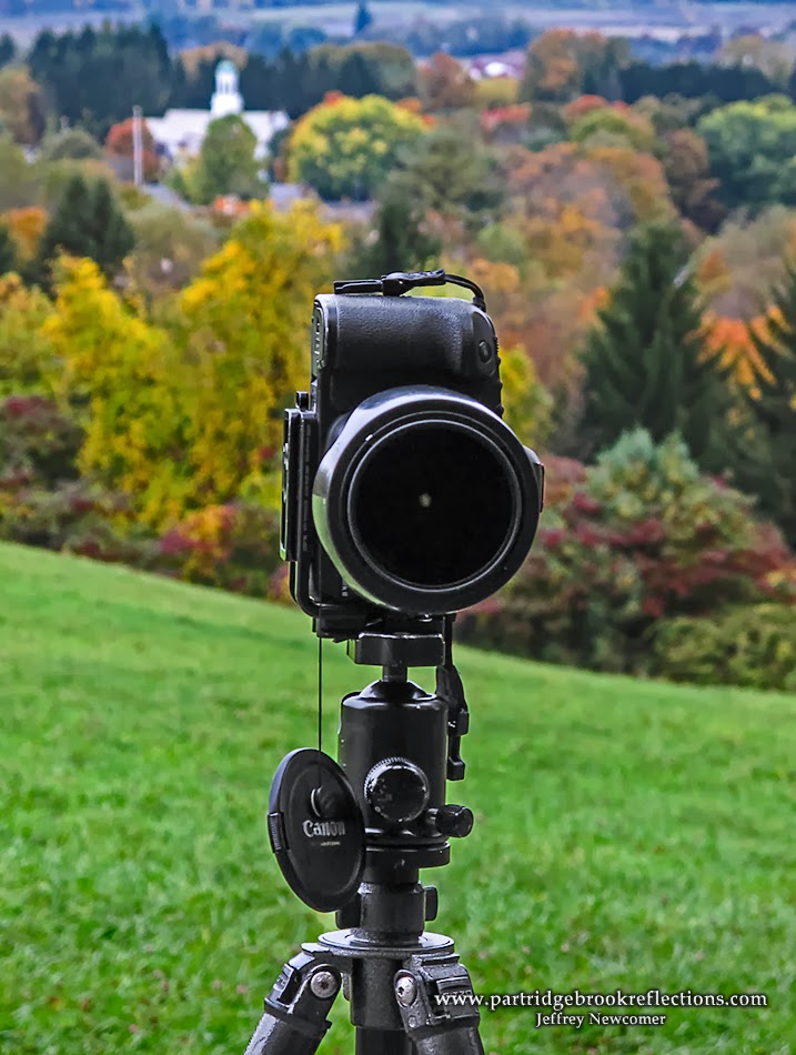
Simply stated an L-bracket looks like a roll cage added to the outside of your camera.  It allows the camera to be quickly attached to a tripod in either the horizontal or vertical position and makes switching from one orientation to the other a very simple and fluid procedure.


Walpole Town Hall Color, Landscape


Portrait Orientation
The L-bracket has a number of important advantages over a fixed attachment to a tripod.  After taking shots in the horizontal (or landscape) position, I often want to grab the same scene in the vertical (portrait) mode.  With the camera fixed to the plate, I have to flip the body over to the side of the tripod.  The result is that the framing changes as the camera moves
Miss Aligned
& Unbalanced
down and to the side of its original position making recomposing necessary.  Additionally, with the camera hanging off to the side, the tripod becomes less stable and more subject to accident and vibration.  With the L-bracket, the camera stays centered stably over the tripod legs and the framing of the image is not altered.  The difference is especially noticeable when photographing subjects which are close to the camera.  You will be surprised what a difference this makes in capturing the exact composition that you want. 


L-Bracket Aligned & Stable


The L-bracket also provides some protection to the camera. This is an unintended benefit and the bracket doesn't cover the entire body, but this "roll-cage" has saved me a few times from drop-related damage.  Besides it  looks cool.


Engulfed, Portrait
L-brackets are available for a range of cameras.  They are generally custom designed for each body to allow access to all the important
buttons and connectors.  Arc-Swiss is the most common connector and you must have a head which takes this system, but older tripods can usually be adapted for this connector.  L-brackets are widely available.  Mine came from Kirk photo, but really Right Stuff is also a reliable source.  Depending on the camera they range in price from $125-nearly $200.  It may seem like a lot of money for a piece of metal, but it is well worth the expense.   This is something you will use on every shot, so don't skimp on the quality. I typically order my L-Bracket at the same time that I order a new camera. 


Bracket Custom Cut for Connectors


If you don't have one already I would strongly suggest that you consider getting an L-Bracket for your camera.  You will find it makes a simple but persistent improvement in your work.

Really Right Stuff has a nice video which demonstrates the use and benefits of L-brackets.

 Jeff Newcomer

partridgebroo0kreflections.com

Sunday, February 10, 2013

Photographic Composition, Drawing the Eye

Pointing the Way

Sometimes drawing the eye can be quite literal, St Vitus Church, Prague


One of the essentials of good photographic composition is the use of techniques to draw attention to the subject of the image. We refer to this as "drawing the eye to the subject", but whatever it is called, it is a key part of adding coherence and impact to your images. There are many ways to effectively draw the eye, but as I searched through my images for good example, it became clear that the best approach is often a combination of more than one. Here are a just a few of my favorite eye magnets. 

Eye Magnets


Positioning, Rule of Thirds
The positioning of your subject can have a strong effect on the focus

Rule of Thirds
of attention. Years ago when I was getting more serious about my photography, a gentleman approached to compliment my images. He particularly liked my eye for composition and my "effective use of the Rule of Thirds". I thanked him and then rush home to look up "Rule of Thirds". All I knew was that I had a sense that a subject looked better when it wasn't placed in the middle of the image. Who knew I was applying a "rule"? The Rule of Thirds is merely a graphic representation of the observation that subjects are more visually pleasing when they are placed away from the center and near the intersections of lines drawn to divide the image into nine equal rectangles. It seems to be based on connections deep within our visual cortex. These rules are all made to be broken, but the point is that the eye tends to be drawn to these points on the image. It works. Look it up. I did! 

Thinking of Home


Leading Lines
Marshal Point Light

Leading lines refers to the the use of lines running through an image to
point to the center of interest. Diagonals are especially powerful, not only to focus attention but also as elements that add a dynamic sense of movement and life to an image. The lines don't have to be actual straight "lines". Curves or aligned elements in the scene, such as trees, rocks or even people can point to the center of interest.


Leading Fence
Pemaquid Light


Jenne Farm, Serpentine Leading Line


Selective focus
Landscape photographers often work to capture sharp focus from

Deep DOF
foreground to distant subjects. For me, ridiculously broad depth of field has been a persistent obsession. Wide angle lens, small apertures and image stacking are all useful to reach the goal of razor sharp DOF. Old habits are tough to break, but increasingly I have been using shallow, selective focus as another technique when I want to simplify an image and highlight the key features. A couple of weeks ago I was shooting the corn stalks in the fog
around Walpole, New Hampshire. I found one ear of corn which was trapped by
Selective Focus
encircling vines. After my usual focus stack to get full DOF, I opened up the aperture to selectively focus on the lonesome ear. I felt that the dried corn stood out best against the soft background. These days my approach to landscape focus is to first capture the images I need for full depth of field, but then finish with a few wide aperture shots to give me the option of isolating the key element(s) with selective focus.


Selective Focus
 
Selective Focus


Color
Color and Leading Lines
The use of bright color can also make a subject stand out. The key is to watch the background for contrasting, noncompetitive color. The background colors can also be desaturated in post-processing. I try not to overdo this type of manipulation, but it is all a matter of taste and some photographers choose to completely desaturate the background for maximal, but artificial, effect. In black and white images, similar effects can be achieved with contrasts of texture and light. 


Spotlighting
Cow in Shaddow
Lighting can be used to highlight important regions of an image. It is great when I can get natural light to spotlight a subject, and occasionally a splash of properly color balanced flash can be effective. I have previously discussed the use of masks in post-processing to spotlight subjects and to add a sense of depth. I will often use this spotlighting technique to add a splash of
Spotlighted & Rule of Thirds
brightness and diminished contrast at the distant end of a receding dirt road or trail. The same approach can be used to draw attention to faces or other important elements. It often takes just a touch of brightening to make a surprising difference. The key is to avoid making the effect so strong that it becomes obvious. 

Roads End Farm


All these approaches can work wonders on your compositions adding coherence and balance, but as I mentioned the best results often come from a combination of these techniques. The decision about which to use will be dictated by the scene. Just keep focusing on drawing the eye.


Rule of Thirds, Leading Lines and Spotlight

Lonesome Road, Spofford, NH

As important as it is to draw the eye to your subject. it is equally critical to avoid elements that might divert the eye from the path you have created.  Next week's blog is about avoiding and removing the distractions that can weaken your compositions.


Sunday, January 27, 2013

Chromatic Aberration


Foiling the Fringe in the Camera and in the Digital Darkroom


The Fringe

You know the old saying, "There is nothing that is certain except death, taxes and Chromatic Aberration". Chromatic Aberration (CA) is a physical property of light when focused by a lens and the result is varying degrees of color fringing which you may have noticed, especially on the edges of your images. 


From Wikipedia
The Physics
Ever since Newton passed sunlight through a prism, we have known that different wave lengths of light are bent to different angles as they pass through a lens. This is called dispersion and because a simple lens cannot focus all colors of light on the same plane (your camera's sensor), colored halos or fringing is created. This effect is seen most prominently on the edges of images and in areas of high contrast. Red and green bands are most common, but blue, yellow and purple may also be seen. This is all called Chromatic Aberration and although saying "Chromatic Aberration" may make you sound intelligent at the photo club meeting, the color banding can contaminate your images. Fortunately there is much that can be done to minimize or eliminate the fringe, both in the camera and in post processing.


In the Camera

Throw Money

As expected, more expensive lens typically do better with CA. 

From Wikipedia
special coatings and combinations of multiple lens elements can reduce and compensate for light dispersion. Achromatic and apochromatic lens also use special materials, such as fluorite, that have properties of low dispersion. Think of this when you are pondering how a lens could cost several thousand dollars. 


Avoid High Contrast Situations.
Creatively it is not always possible or desirable to limit high contrast in your images, but, especially on the edges, contrast control can make a big difference.

Stop Down
CA is more apparent at the widest apertures. Stopping down just a step or two from wide open may limit your beautiful bokeh, but it can reduce the CA contamination dramatically .

Avoid the Extremes of Zoom Lens
It is hard to engineer zoom lens that can offset dispersion across the full range of the zoom. You will usually get the best results somewhere in the middle of the range. Extreme wide angle lens may be especially susceptible to this effect.

Get Ready for the Digital Darkroom
There are a couple of things that can be done to get the image in the camera ready for the work that can be done in the digital darkroom. First, this another situation where shooting in RAW can make a big difference. The great flexibility of RAW images makes it easier to correct for CA in post processing programs such as Camera RAW. Also, one simple approach is to frame images with extra room around the edges which will then allow cropping of the worst areas of CA without sacrificing the composition.

In the Digital Darkroom 


Fading Crimson
You've done what you could in the field, but you still notice ugly fringing at the edges of your images. Fortunately, with every new version of Photoshop, the tools to control CA have become more effective and easier to use. Here I will be speaking specifically of Photoshop and the newest version of Camera RAW, although Lightroom approaches the problem in a similar manner. Other image editing software, such as Paintshop, have their own solutions to this problem. 

Lens Correction in Camera Raw

Fringed
In newer versions of Photoshop's Camera RAW correction of CA is largely automatic. Within the Lens Correction menu, the "Color" tab features a simple radio button for Chromatic Aberration control. It is almost magic. The program can reads the image meta data to determine the camera and lens used and in most circumstances applies the correct adjustment without further input. This is much easier than in earlier version in
Aberration Control
which individual red/green and blue/yellow sliders required careful manual adjustment. After the automatic adjustment, some fringing may still remain, especially the more difficult axial CA in the purple/green range. Below the automatic button, purple and green sliders allow fine tuning of the adjustment. In addition to controlling the amount of adjustment, the Hue slider can precisely target the color affected. 


Facing the Dawn, Rockport, Maine
Fringed Rungs
De-Fringed


Dealing with Chromatic Aberration can be frustrating, but, with awareness of the problem, adjustments in the camera and in the digital darkroom can be effective in foiling the fringe.
 

Solstice, Spofford, NH